Neo-Traditional Tattoos | What They Are and How They Work
Neo-traditional tattoos
Okay so neo-traditional
You've probably heard the term. Maybe an artist used it. Maybe you saw it tagged on an Instagram post and thought "that just looks like a really good traditional tattoo, what's the difference." And honestly that's a fair reaction because from a distance, across a room, a neo-traditional tattoo and a traditional tattoo can look similar. Bold outlines. Recognizable subject matter. Clearly a tattoo and not a photograph. But get closer and the gap between the two styles opens up fast.
Traditional tattooing goes back over a hundred years. Sailor Jerry, Bert Grimm, all those guys working in shops near military bases and port cities in the early-to-mid 1900s. The palette was limited because the ink options were limited. Reds, greens, yellows, blacks, and not a lot else. The fills were flat. One shade of red per section. Simple shading to suggest depth but nothing layered or blended. And the subject matter was iconic in a way that hasn't really changed. Eagles, roses, daggers, skulls, anchors, panthers, ships. Walk into a traditional shop today and you'll see flash sheets on the wall with the same imagery, updated but recognizable, that's been in tattooing since before the Korean War.
Neo-traditional came along and kept all of that structural DNA and then, somewhere in the 80s and 90s as ink technology improved and artists started pushing boundaries, the interiors of the tattoos got more complex. Way more complex. Take a rose. A traditional rose has a bold black outline and a flat red fill. Maybe three tonal sections inside, a dark red, a medium red, and a highlight. That's it. Now look at a neo-traditional rose. Same bold outline holding the shape. But inside you've got, and I'm not exaggerating, six or seven different tones. Deep burgundy at the base of the petal where the shadow falls. Mid-reds through the body. Pink as it catches light. Almost white at the very tip where the highlight hits. Smooth gradients between all of them. Same flower. Same outline. Completely different level of interior work.
If you held them side by side, and this is an experiment you can do right now on Instagram by searching #traditionalrose and #neotraditionalrose and scrolling for about thirty seconds, you'd see what I mean immediately. The traditional one reads like a stamp. Clean, graphic, intentional. The neo-traditional one reads like someone painted a flower on skin with actual depth, but kept a thick black border around it so it still announces itself as a tattoo from fifteen feet away.
What people get done in neo-traditional
Animals come up a lot. And the style does something to animals that I've been trying to put into words for two paragraphs now so bear with me. The features get pushed. Not into full cartoon territory, not warped, but intensified in a way that makes the animal look more deliberate than a photograph would. A neo-traditional wolf has fur you can almost feel, eyes with actual light reflection in them, and an expression that reads from across the room. But because of that bold outline wrapping the whole thing, it never tips over into realism. It stays planted in tattoo territory. That's the sweet spot the style lives in. Detailed enough to have depth, outlined enough to hold structure, stylized enough to still clearly be a tattoo.
Florals get wild in neo-traditional and this is where the style really separates from traditional. A traditional rose has maybe three color zones inside the outline. A neo-traditional peony, and I'm thinking of one Mia did last year that I can still picture, had so many tonal shifts across the bloom that the petals looked like they'd be soft if you ran your thumb across them. Shadows sitting between petals. Highlights hitting the curved edges. Color moving from deep magenta at the base through three or four pinks into almost white at the tips. And the whole thing still had a fat bold outline around it that made it punch from a distance. That contrast between the soft interior and the hard border is the whole game.
Portraits land in this interesting middle zone. Bold outline around the face, which no realistic portrait would ever have, but the features inside have real dimension. Eyes with catchlights. Skin with tone variation. Enough realism that you can tell who it is but enough stylization that it looks like a tattoo and not a headshot someone printed on an arm. When it's done badly it looks like a cartoon of a person and not in a good way. When it's done well it looks like the person was painted by an artist who respects both the subject and the medium.
Mythological stuff. Greek gods, Norse mythology, demons, fantasy creatures, monsters. Neo-traditional handles visual complexity better than most styles because the bold outline keeps everything readable even when the interior detail gets dense. A neo-traditional Medusa sleeve reads from across the room because of those thick lines, but up close you're seeing individual snake scales and light playing across the face and hair moving in different directions. That ability to work at two distances, clear from far and detailed from close, is something neo-traditional does that a lot of other styles struggle with.
Bigger pieces are where all of this really pays off. Half sleeves, full sleeves, back pieces. When the artist has room to spread out, the color work and the shading depth can go places that a small three-inch piece just can't. You can do neo-traditional at any size but the large-scale stuff is where you see what the style is built for.
Who does neo-traditional at Red Arbor?
Mia. She works in both traditional and neo-traditional, and the reason that pairing matters, and Cory has said this enough times that I feel confident repeating it, is that good neo-traditional work requires a solid understanding of traditional first. The bold outline is the skeleton of the tattoo. The composition rules from traditional tattooing, how elements relate to each other, how the design flows on the body, how negative space is used, all of that comes from traditional tattooing. Neo-traditional builds on top of that with more color and more detail and more complexity. But if the skeleton is bad, if the outlines are shaky or the composition doesn't hold, no amount of pretty color gradients will fix it. It's like putting granite countertops in a house with a cracked foundation. Looks expensive from a distance. Falls apart up close.
Mia gets the foundation. Her traditional work is strong. Her neo-traditional work is strong. Both come from the same structural base, which is why the detail and color in her neo-trad pieces hold together instead of looking overworked or muddy.
Every artist at Red Arbor does quality work. But if neo-traditional is specifically what you're after, ask for Mia.
Cory can do neo-traditional too, especially when it's part of a larger multi-style project. A body suit or a full sleeve that blends Japanese elements with neo-traditional elements with ornamental sections, that's Cory's territory. He's been building large-scale work like that for over 18 years across two continents and more than 26 states. But if the whole project is neo-traditional start to finish, Mia is the pick.
How neo-traditional tattoos age
This is where the style has something that a lot of newer, trendier styles don't, and it all comes back to those outlines.
Bold lines hold. That's been true since tattooing started and it'll be true in fifty years. A thick outline put down correctly will sit in the skin for decades and not move. It won't blur into the surrounding skin. It won't spread. It stays where the artist put it, which means everything inside that outline, all the shading and the color gradients and the tonal transitions, stays contained inside a defined border. The color might mellow a little over ten or fifteen years, that happens with any tattoo that uses color, but it mellows inside a structure. It doesn't wander.
That's a real advantage over styles that skip the outline entirely. Watercolor tattooing is the obvious comparison. A watercolor piece at year one looks gorgeous, soft edges, dreamy color transitions, no hard lines anywhere. At year eight or ten some of those edges have migrated because there was nothing holding them and the soft transitions have gotten softer and eventually soft crosses over into blurry and blurry crosses over into "what is that." Neo-traditional was built, structurally, to avoid that exact problem. The architecture prevents the decay.
But. And I need to say this because some people hear "ages well" and think "maintenance-free." Sun still fades ink. Any ink. All ink. If you get a neo-traditional half sleeve with saturated reds and oranges and then spend the next five summers at Lake Madison with your arms out and zero sunscreen, those reds will dull. The oranges will shift. It won't happen overnight but it will happen, and once color fades in a tattoo the fix is a touch-up session, which costs money and time that sunscreen would have prevented. So. Sunscreen. Moisturizer. Boring advice. Nobody's excited to hear it. But the difference between a neo-traditional piece that was maintained and one that was neglected is visible and once you see it you can't unsee it.
Neo-traditional questions
What does a neo-traditional tattoo cost at Red Arbor?
Same rate as any other style. Cory charges $2,500 for an eight-hour session and everything is priced by session, not by style. A smaller neo-traditional piece, a single animal portrait on the forearm or a standalone floral composition, might get finished in one session depending on detail. A half sleeve probably takes two to three sessions because the color layering and shading in neo-traditional is time-intensive, you can't rush gradients, and each layer needs to heal before the next one goes on top. Full sleeve is three to six sessions. Book through the contact page for a number specific to your project and bring reference photos. "I want something neo-traditional" is a starting point but the more specific you are about subject and size the more accurate the estimate.
Can you do neo-traditional without color?
Yeah. Black and grey neo-traditional shows up at the shop more than you'd think. Same bold outlines. Same detailed shading. Just no color at all. All the depth built through grey tones and contrast, and honestly some subjects look better that way. A black and grey neo-traditional portrait can have more mood and atmosphere than a full color version because when you strip the color out, all the viewer's attention goes to the shading, the contrast, the expression, the light direction. People who have a lot of existing black and grey work tend to choose this route so everything matches.
How is neo-traditional different from new school?
New school goes further. A lot further. New school takes the bold outlines and the color and cranks everything up. Proportions get warped on purpose. Colors go neon, like electric blues and hot pinks and lime greens that look like they were pulled off a highlighter display at Office Depot. The whole aesthetic leans graffiti, comic book, Saturday-morning-cartoon-on-sugar-cereal. If that's your thing, cool, genuinely. But it's a completely different energy. Neo-traditional keeps the classic tattoo framework closer. The proportions stay more realistic even when they're stylized. The colors are rich but controlled, not neon. The compositions follow rules that have been in tattooing for a century. Neo-traditional is an oil painting in a bold frame. New school is the album cover of a ska band from 1998. Both valid. Very different walls they'd hang on.
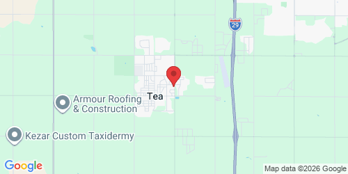
Red Arbor Tattoo. Tea, South Dakota. If you know where the Casey's is on Heritage Parkway you're about thirty seconds from the door. Ten minutes south of Sioux Falls. Neo-traditional, traditional, Japanese, black and grey, whatever the style. Contact page or (605) 408-0837.